
Let’s take a look at the fourth and fifth steps: Analysis and Reconciliation.
With the wireframe in hand, we were able to hold useful discussions and workshops with the project team at CASE. We worked together to further refine the intended user flow and experience. Multiple adjustments to the layouts were made for two reasons: (1) to prioritize information presented to users, and (2) to optimize each screen for information density as well as readability.
We also conducted usability testing, inviting members of the public to our lab. We walked them through the wireframe and prompted them to give feedback on whether the interface was user-friendly enough.
During this period, we continued to make multiple refinements to the wireframe. If we did not produce wireframes and instead made the edits on high-fidelity mockups, the process would have easily taken more than twice the duration. Additionally, the wireframes doubled up as a visual artifact to ensure that our project team and CASE were synched in our expectations for the app. This drastically reduces the change of any misalignment or misunderstanding between our client and our team.
Finally, we moved on to the final, huge step of our process, starting with Design.
Before starting the design process, there were a number of things we had to establish:
- Wireframe/storyboard: to tell us the exact screens we needed to produce
- Style: the kind of look and feel we want to achieve; from our earlier research, we wanted it game-styled with friendly and approachable colors
- Design objectives: the clear outcome to achieve with our design. Price Kaki is the first of its kind, combining price search, crowdsourcing, and gamification features (with leaderboards and a reward system). Thus, our design goal was to surface these 3 concepts that are appearing together for the first time in a single app to users, without confusing or overwhelming them. This turned out to be one of the most challenging design goals we’ve ever had.
- Mascots: And finally, defining how our mascots ‘Ka’ and ‘Ki’ may interact with each other!

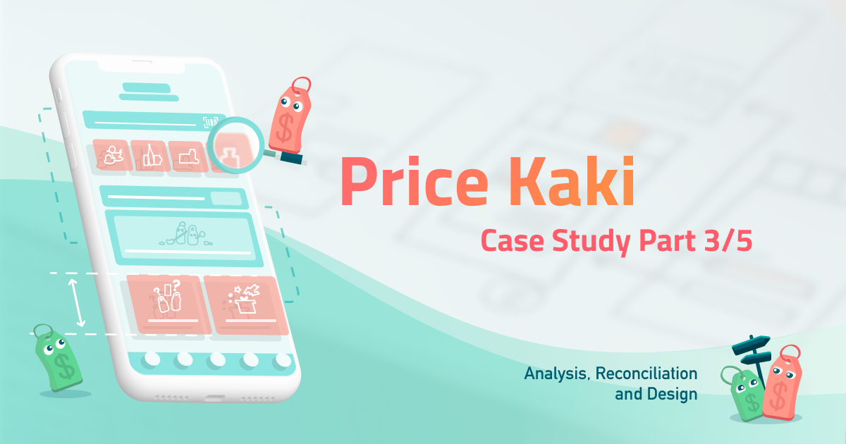
Price Kaki has two main components that are most significant to its raison d’etre: the home screen—the main functional screen that users encounter, and the price comparison screen which provides price information of the same item at different locations. Let’s start with the first.
Designing the home screen was pivotal in forming a great impression. In the home screen was our main opportunity to surface the 3 key functionalities of Price Kaki to users: (1) Price search; (2) Gamification; and (3) Crowdsourcing mechanics. To that end, we ranked the importance of these features, then laid them out on the screen in a hierarchy of importance.
This way, we hoped users would be aware of the existence of gamification and crowdsourcing functionalities. The price search feature right at the top would still be prominently convenient and easy to use.
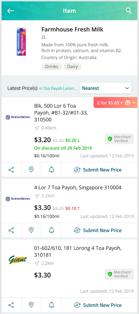
Next was to design the price comparison screen. This was the hardest screen in the whole project to design. We had to balance user-friendliness, the small screen space available, and the wealth of options and information to make available to users. To give an example, this is a list of information we wanted to surface to users (even after going through rounds of minimization exercises!):
- Item (grocery/hawker) information such as name, packet size, country of origin
- List of locations and brands that carry the item
- And for each location, we wanted to
display information such as
- Latest price
- Upward or downward shift from previous price
- Full address of location
- Distance between the location and user’s current position
- When the price was last updated
- Whether the price has been verified by the merchant
- Whether there has been a promotion, and if so, what type it is (we support three types: discounted prices, freebies, and timed discounts)
- Display other items related to the user
At the same time, we wanted to allow the following actions and interactions:
- Filter outlet listing by distance, or price
- Allow user to get Google Maps directions to the outlets
- Allow user to share price or promotion information to their friends
- Allow user to add the location to their bookmarks
- Allow user to contribute prices
All of these added to a large collection or information, actions, and interactions to fit into a 5-inch screen. Our primary fear was that it made the screen too cluttered. This would compromise on its readability. After many rounds of internal brainstorming exercises and design revision, by Price Kaki’s pilot launch in September 2019, this is what we came up with:
Despite spending an enormous amount of time and brainpower on the home and price comparison screens, I felt that there would always be room for improvements. We could do better. Later in early 2020, we led another round of redesign which drastically improved user experience for these two screens. This will be covered in the final part of this case study.
In the next article, I’ll be covering the last stage in our UPWARD methodology, development, and more.
Originally US is an Award Winning Singapore Mobile App Development Agency.