Let’s jump right in to the first step: User Study.
An app is nothing without its users. Beyond noting down the business requirements from our clients (CASE), we spent ample time understanding and researching potential users of our app. Interviews were conducted across Singaporeans of various demographics. Extra focus was given to certain groups, whom we hypothesized would likely benefit most from Price Kaki’s price comparison feature:
- Age group 41-60
- Married
- Income below $6000
And for those who fit these categories, we examine their behaviors and motivations. Some of the questions asked include:
- [Behavior] How frequently do you go grocery/hawker shopping?
- [Behavior] Do you have a ‘regular’ store, and why?
- [Behavior] Do you visit different stores for different items?
- [Behavior] Are you currently comparing prices? If yes, how?
- [Motivation] Who do you normally shop for?
- [Motivation] What are the top factors that make you prefer to go to a certain store?
- [Motivation] What is your primary concern when deciding which product to buy?
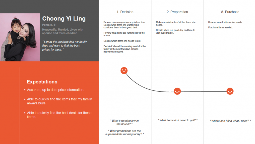
Building on our learnings from their responses, we were able to distill our potential app users into 5 distinct personas, including the Busy Professional, Deal Hunter, Working Parent, Helpful Son, and Housewife. Using these as a reference, we then mapped out distinct user journeys. An example can be seen below:
Our second step is the Product Study.
While understanding users of our app is important, a myopic or self-focused view would impair the success of Price Kaki. We wanted to see what was available in the market to learn from any strengths and weaknesses. Over 12 grocery price comparison apps and 11 websites in the region were analyzed. Interestingly, we couldn’t find any that related to hawker pricing, as it was something unique to Singapore and not done before.
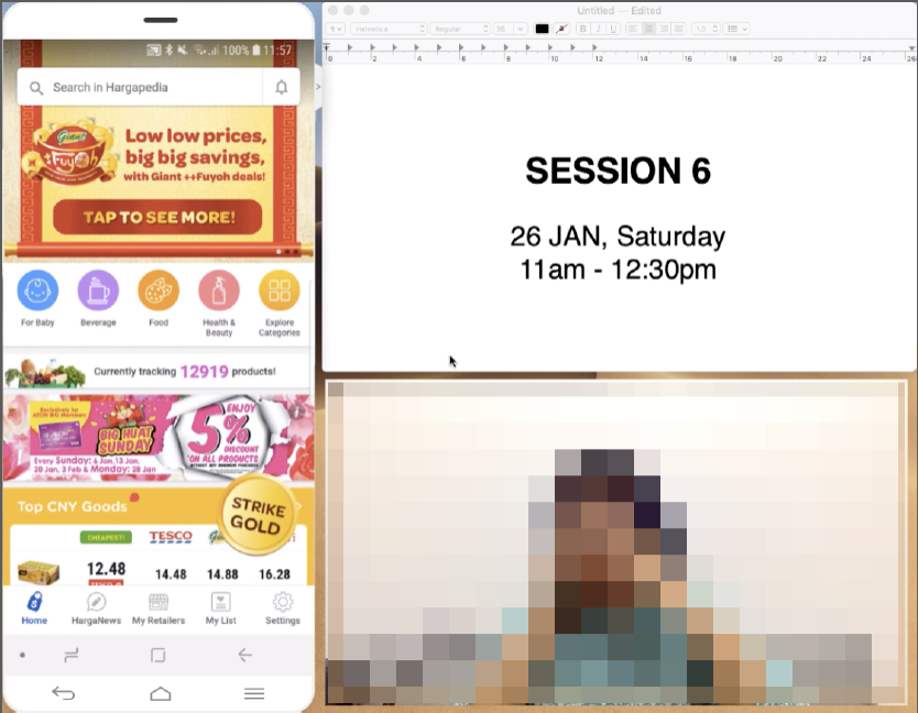
From the 12 apps, we noted similarities in how information was presented and derived the reasoning behind it. We then tasked our interviews to execute various actions through those apps—such as searching for a particular grocery item, or comparing which items were cheaper. Everything was recorded for analysis. This included the interviewee’s facial expressions and subtle cues, such as frustration, satisfaction, joy, and the app’s screen, to see how interviewees navigated the app.
Then, based on how interviewees reacted to the apps, we designed a usability score matrix to score these apps.
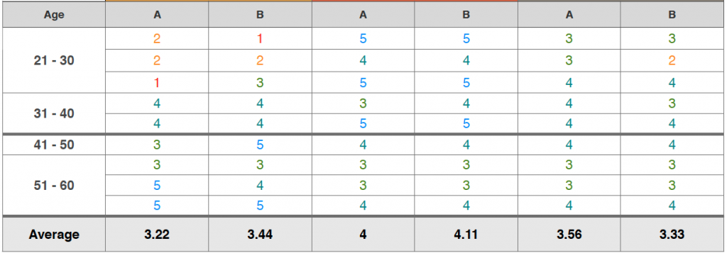
From here, we could quantitatively analyze the frustrations and strengths of the 12 apps individually. These eventually became valuable lessons when we began designing Price Kaki for CASE.
At this stage, we then began brainstorming about what our concept, style, and app name would be. Armed with ample findings and deep insights, coupled with our years of experience building user-friendly apps, we sat down to work on a concept and tone consistent with what we wanted to achieve in the app.
After some deliberation, the name “Price Kaki” stood out to us. A key feature of our app was crowdsourcing, allowing users to submit and contribute prices to benefit other users. We saw this behavior as similar to a community of kakis, sharing and helping each other on price matters. And thus, the name Price Kaki was happily agreed upon.
To portray our app as uniquely Singaporean and approachable, we decided to incorporate Singlish into it. Ground rules about copywriting were established—something we learnt during our experience doing copywriting for SG BusLeh. It was one of the first apps to prominently feature Singlish, and a lot of care went into ensuring that it was genuine but readable.
Additionally, one striking aspect of Price Kaki’s design is looking and feeling like a mobile game. It might seem intuitive to expect that our main target audience, 41-60 year olds, would not prefer such a style. However, our tests prove otherwise: this surprisingly resonates with them, as the bulk of this demographic would use their smartphones for games, rather than for utility apps. By designing Price Kaki to appear like a game, our target audience found the app more approachable and appealing.
Moving on, we proceeded to our third step, Wireframing.
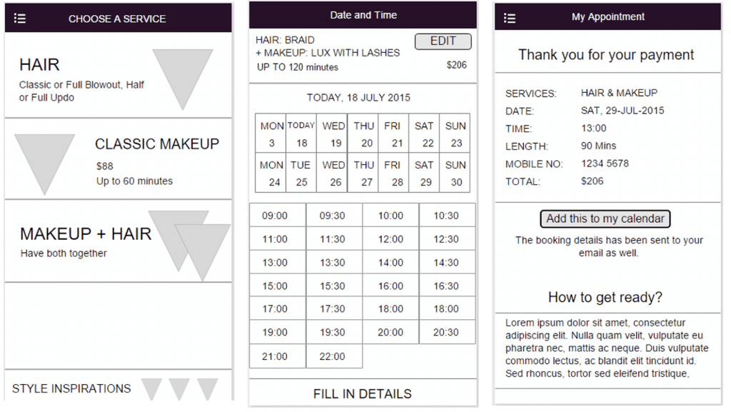
If you’ve never worked on app or website design processes before, this may be alien to you. Simply put, wireframes are low-fidelity design artifacts. They are integral as a common document that helps us vendors communicate our intended app layout and user flow to clients. They are usually done with simple shapes just in black and white.
This simplicity would allow us to quickly and efficiently produce a visual illustration of the app, without investing weeks to make an unapproved design pretty. Wireframes are also easy to edit, so we can quickly iterate with our client to achieve what they have in mind. Here’s an example:
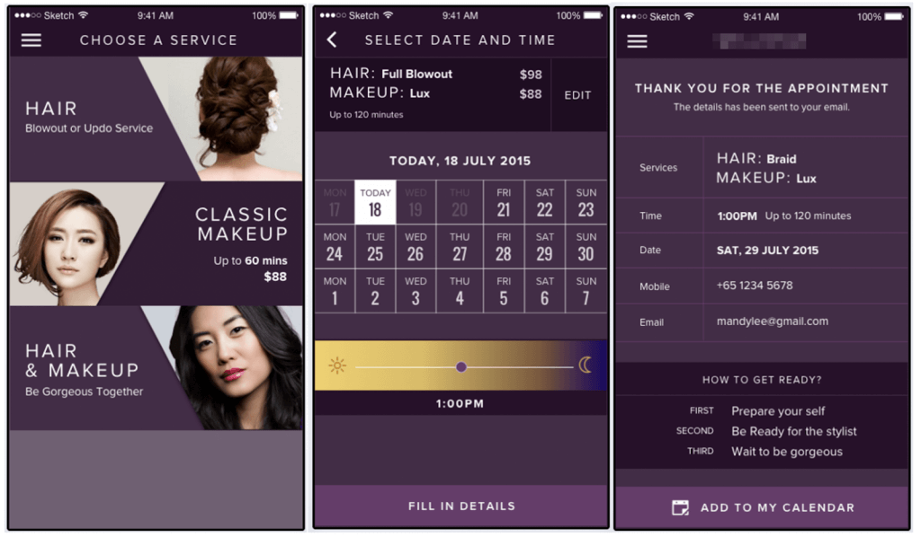
…And compare this to how an actual mockup looks like:
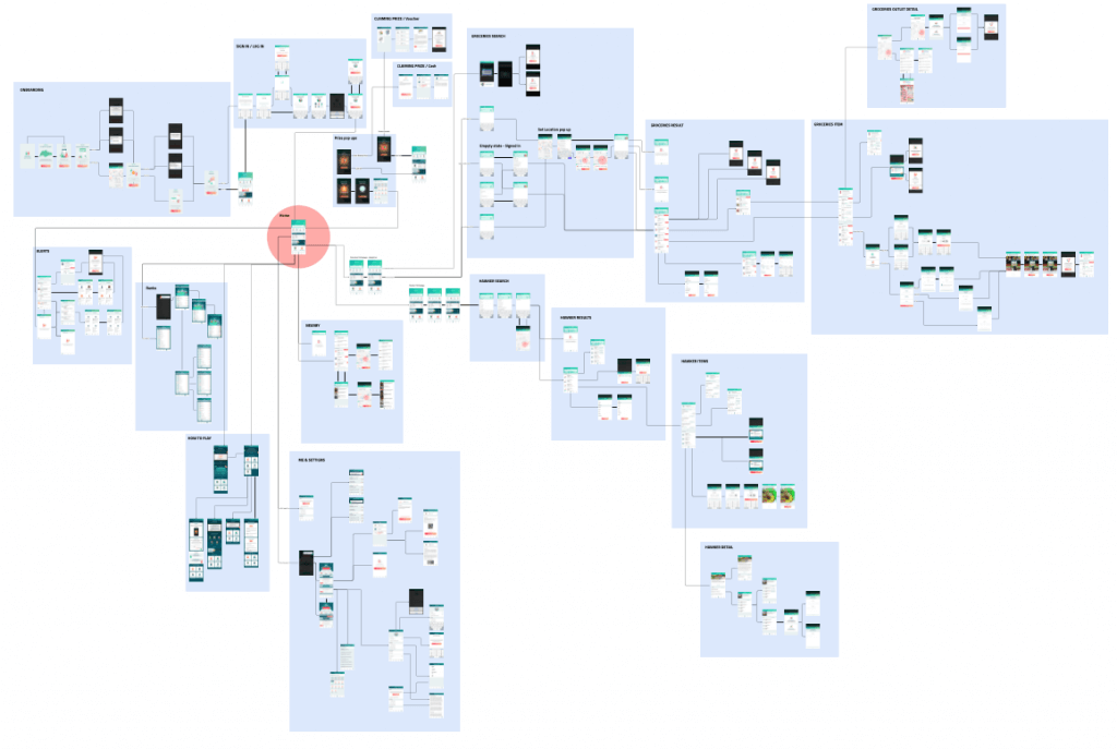
For Price Kaki, we produced over 200 screens in wireframe just in a matter of days. They were organized into a storyboard to allow our project team and client to clearly see how each screen was correlated.
Continue reading about our UPWARD methodology in an upcoming piece.
If you require help from an IOS App Developer in Singapore or an Android App developer in Singapore, speak to us.
