
We were elated to have finally launched Price Kaki, but our work was not done yet.
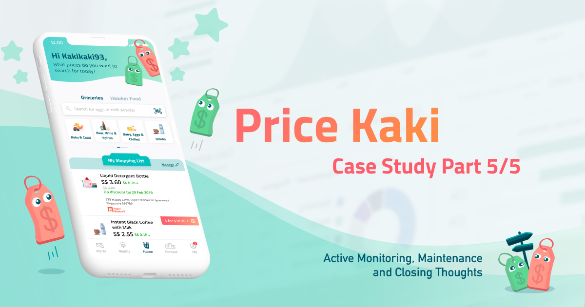
Welcome to the final piece of our Singapore Mobile App Development case study: starting from the essential but often less glorified work of Active Monitoring, Maintenance, and Support.
Even with the most resources available and best engineers, Apple, Microsoft, and virtually every other software company periodically releases bug fixes and updates to their software. Both our company and our clients can never fully anticipate what users would do in the app or what problems they may encounter. As such, it is important that we provide support and maintenance services after the initial warranty period.
By engaging us for this, we are able to allocate resources to continue actively monitoring the entire Price Kaki system. Potential issues are identified, and maintenance and support provided many times even before users and our clients become aware of the issues. In spite of the high complexity Price Kaki has, we are very happy to share that the high-quality development work we put in resulted in a very low incidence rate related to the functioning of our mobile app. This has allowed us to focus energies on how we may further improve the experience for Singaporeans, rather than spend time on bug fixes.
We began our journey of continued improvements. One crucial post-launch activity would be to capture user feedback, and iterate on our features and design to improve user experience.
Price Kaki’s home and price comparison screen were the most important, as mentioned in the previous part of this case study. We wanted to see how we could further improve the user experience of these areas in the app.
To that end, we focused heavily on consolidating feedback received on those screens through these channels:
- App roadshows and events organized by the CASE team
- Feedback from CASE management
- User feedback through our official in-app feedback channel
- User review and feedback on Google Play Store and Apple App Store
- Quantitative analysis from data points captured directly from users’ behavior within the app. We leveraged on analytics platforms such as Google Firebase
With this feedback garnered, we concluded two key takeaways.
- For the home screen: our original design objective was to make clear to users the presence of 3 core features. This included price comparison, gamification, and crowdsourcing. Yet, despite the design testing well during usability testing, a significant number of users still found the home screen overwhelming.
- For the price comparison screen: users found the information furnished on screen useful. However, it had given them a cognitive overload before they could slowly make sense of the information presented.
From these insightful findings, we went back to the drawing board. We challenged ourselves to do even better, and made these changes:
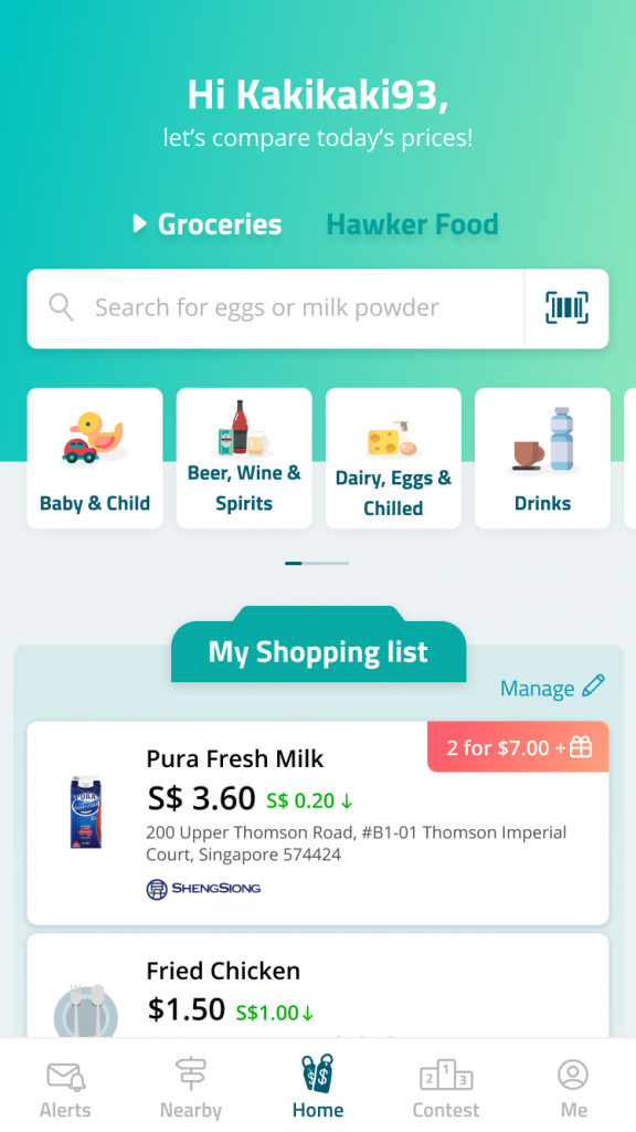
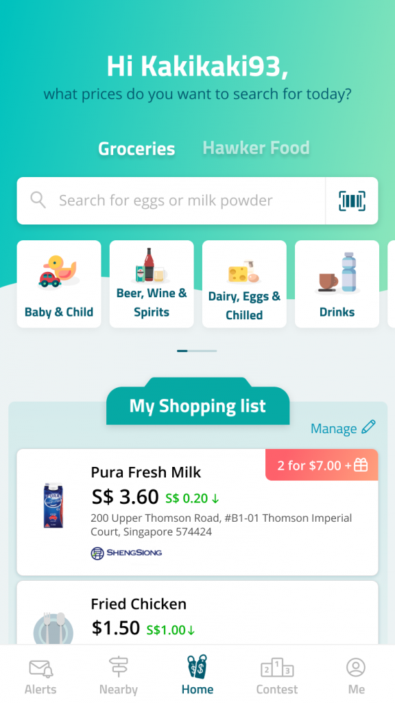
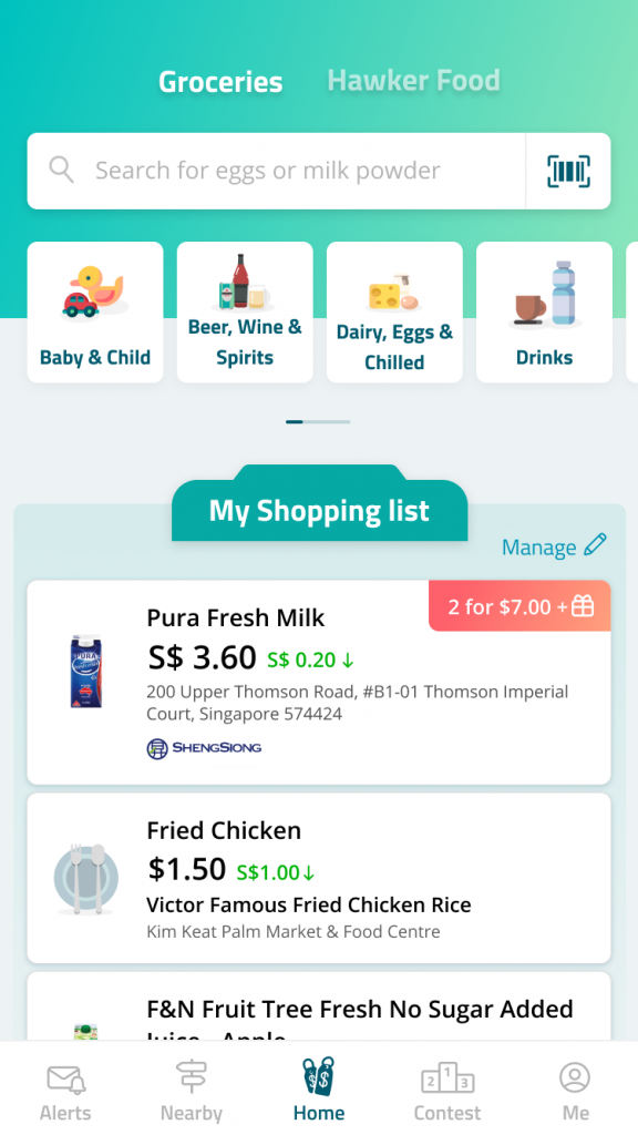
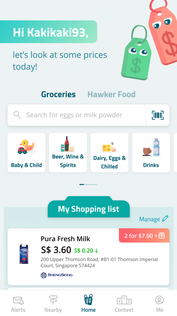
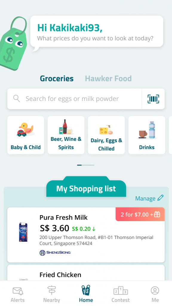
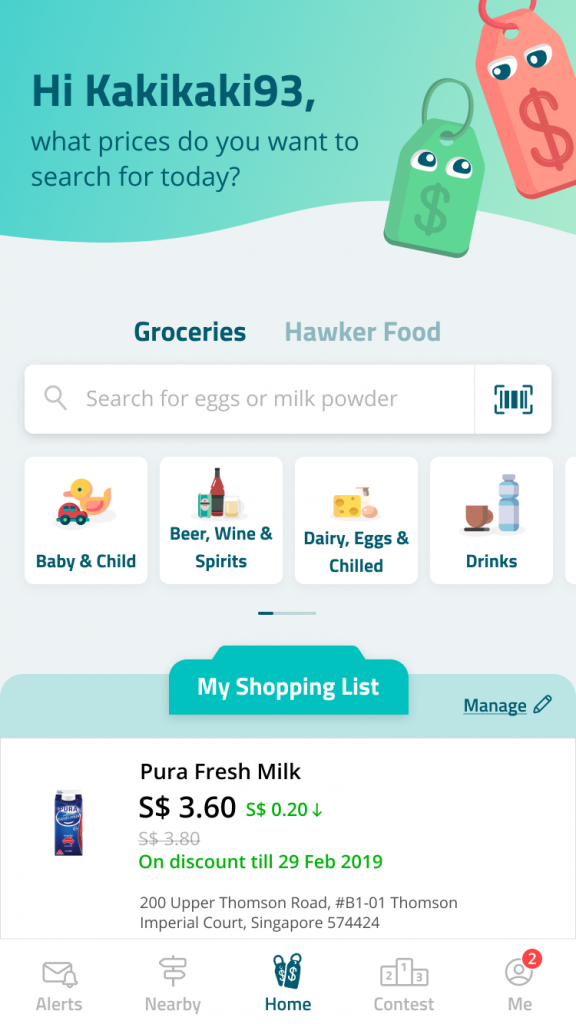
- For the home screen: we decided to make the home screen hyper-focused on price search. It’s the most frequently used feature in the app; many users who use the price search simply do not bother with the gamification and crowdsourcing features. As a result, we moved our leaderboard and crowdsourcing information to their own tabs. A new shopping list feature was introduced. It helped users to easily track prices of groceries and hawker food they cared about without requiring a tap.
With these items in mind, we came up with 5 different variations of the new home screen and tested it with users and our client, before deciding on the final design:
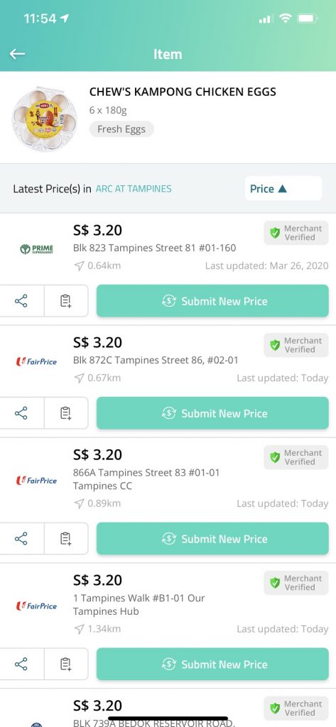
- For the price comparison screen: we relooked the information hierarchy and reorganized the information display. Consequently, we (1) increased the font size contrast between higher and lower hierarchy-tiered information to decrease cognitive load; (2) shortened the vertical height for all information boxes. This would make it easier to compare prices across different locations; and (3) placed additional emphasis on the “Submit New Price” action button. This encourages exploration of its functionality while increasing the submission rate.
Here’s the end result of our improvements that we’re proud of:
Home screen
After testing the 5 different screens with users and CASE, we derived this final version:
Price comparison screen
And this is our new and improved price comparison screen:
And finally, here’s some closing thoughts for this case study.
It has been an incredible journey working with the team at CASE on Price Kaki. We were happy to have been selected by CASE for this project as it gave us an opportunity to use our technical expertise for the benefit of Singaporeans.
This project wasn’t just commercial work to us. We were passionate about what CASE wanted to achieve with this mobile app, and put our heart and soul into this project to ensure its success. Price Kaki was built to be a joy for Singaporeans to use, empowering them to make informed purchasing decisions for hawker and grocery items.
Working with very understanding and appreciative clients also allowed our team to excel. Alongside CASE, we could deliver well and beyond what was stated black and white in our contract.
Moving forward, Price Kaki has been recently launched across the whole of Singapore. Our app is ready, our data is ready. We are very proud to announce this official nation-wide launch as of 26th June 2020, 2pm. You can read about it in The Straits Times, or in Zaobao!
If you would like to learn more about how we could apply our expertise, experience, and processes to make your next mobile app project a success, drop us an email at hello@originally.us. We’d be happy to assist you!