The True Cost Of Design
“Why is design so expensive?”
This is a question we get asked a lot by our clients. The truth is — not all designs are made equal, and it shows.
Have you ever encountered a website or mobile application that looks pretty, but frustrates you after the first few uses? How about apps that work fine, but have designs so unimaginative and bland that you wonder how much they paid the designer to complete the job or if you could do a better design job?
It’s a process — The Tri-Facated Nature of Great Design
Over the years, our clients have come to us with different requests for digital products, but if we were to categorize them, they will boil down to the trifecta – relevance, intuitiveness and beauty, all of which has to be done within possible means.
We live complicated lives, and digital products should simply function well, entertain us and if possible, excite us by pushing the boundaries of innovation. The ability to nail these three factors in the head is what often creates a stand-out product.
1. Relevance (How relevant is your design?)
Functionality and beauty won’t even matter until the product is useful and relevant to the user, rendering customer relevance so important.
In digital product design, we not only do digital graphics, but a bulk of our job also encompasses user journey planning. In projects, digital product designers are the ones fighting for the users by taking the time to learn the user’s motivations, behaviours and even frustrations through user research. By empathising with them, we design platforms that are relevant to them and within their capabilities to use. Sometimes we even think ahead of what the user wants, to bring them conveniences that they never know they needed.
Equipped with an understanding of customer behaviour and psychology, customised experiences are what we design for the target users.
2. Intuitive (What is intuitive design and why is it important?)
We don’t have to be experts to tell if a design is intuitive or not — it is something that comes naturally to everyone. However, it requires a lot of thought and planning in bringing it to fruition.
Jared M. Spool, excellently describes the process of designing an intuitive interface through the concept of “The Knowledge Gap”. We don’t need to design to the left of the current knowledge point, because it’s all stuff the user already knows. And we don’t need to design stuff to the right of the target knowledge point, since the user won’t be needing that information (for this task, at least) (Spool, n.d.).
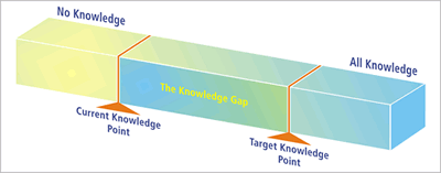
The bridge between the current and target knowledge is the Knowledge Gap and this is where design happens. This is where the designer considers the user’s familiarity and proficiency to design an interface that assists the users in completing their goal. If done right, intuitive designs could mean navigating through the pages effortlessly, as users know exactly what to do to get to where they want to be.
So, you might be wondering, what exactly does intuitive design look like?
Well here’s the thing, there is no definitive answer, because it ultimately depends on who the user is. Most designers will agree that it’s all about simplifying the process for users. However, this can be done in different ways, depending on the demographic. For example, invisible designs such as “drag down to refresh”, “swipe left to delete” provide convenience for the experienced user. However, the inexperienced user without prior knowledge might take a few tries and the help of Google to complete the same task. In fact, they would much prefer visual cues like icons and text instead.
That’s why taking the time to work with the user is crucial. We empathise with them — their abilities, drive, joys and frustrations — through this we will then be able to design something that they want and need. This allows us to predict what they want and cater to their desires and grievances. By minimising the chances of a frustrating experience, users leave the platform with an overall positive experience, which can convert to higher user retention rates.
3. Beauty (The aesthetic appeal of your design)
With a well-functioning product, more than half the battle is won. What takes the product to the next level is if it is accompanied by beautiful design. Great designs provide clarity and guide the users through the most complicated tasks with ease. Tools like animations and illustrations can even entertain and delight the users, creating a more interactive and engaging experience for the user.
In the past, users prioritised functionality over aesthetic design. Today, users’ expectations have evolved together with the design field. Now, people expect usability by default and are seeking products that are more than functional and usable. Users want to experience pleasure, to stimulate their senses. They want the products they use to evoke positive emotion in them (Nikolov, 2017).
An added benefit is that happy users tend to be more tolerable when experiencing unforeseen and unavoidable experiences (e.g. lags or glitches) on the platform. Undeniably, aesthetic design is crucial in satisfying these needs and in turn leading to higher satisfaction of users.
The Importance Of Getting It Right The First Time
If an agency is willing to charge half the amount than the other, why pay more, right?
Designing a product that intricately balances relevance, intuitiveness and beauty takes time, rigor and expertise. “Cheap” design may be tempting, but what it often comes with a suspiciously short timeline, and unconventionally low man day rates. You may run the high risk of spending more time and money to fix the parts of the product that have been overlooked. Coupled with how frustrating the overall experience can be, suddenly paying slightly more for good design seems worth the investment.
After working with many clients, we have encountered numerous instances like this. Where clients come to us, after having built a disappointing product with a “cheap” agency.
A disappointing product is one thing, but once a negative experience is associated with the business, even when the digital product gets a major face lift, it will take a lot to win back the confidence of the user.
Setting You Up For Success
Evidently, a lot of work goes behind the scenes into engineering good design. Beyond understanding the importance of good design and why it is worth paying for, make sure you also select the right team to work with you on your exciting project. They should be a team that gives you confidence, because you’re in it with them for the long haul.
Your success is the same as ours and that’s why we’re with you at every step of the way. To make sure that you make the most out of the product, we perform market studies even before the design phase. This allows us to observe the competitors to fully understand your business and your position within the market. Thereafter, we highlight key goals and plan the direction to realise them together with you.
TLDR (Too Long Didn’t Read)
Designers do much more than just painting pretty pictures! Our responsibility is also to ensure the satisfaction of users, and we do so by conducting extensive user research to empathise with the user and design the best experience we can for them.
Aside: Check out our guide on picking the right mobile app development agency.
At Originally US, we do not embark on building a mobile app unless we want it to be successful, because your success is also our success.
If you’re looking for a trusted mobile app development company to build your app, let us discuss how we can help you! Chat with us on Whatsapp today.